Learn everything you need to know to successfully use color in design. Discover color theory, color meanings, and color modes to help you pick the right palette for your work.
Cover image via vhpicstock.
You make color choices all the time, even if you don’t realize it. It usually happens by instinct, but there’s actually an entire science behind it called Color Theory. Color Theory describes how different colors relate to each other, and how they look when they are combined into many colored schemes. An offshoot of color theory is color psychology, which explores colors and emotions. Combined, these two areas of color knowledge are important information for anyone dealing with colors, whether you’re a small business owner creating a flyer for an upcoming event, a designer selecting a color scheme for your next project, or an entrepreneur designing a logo for your newest startup.
In this complete guide, we’ll go through the basics of the color wheel, color theory, and color meaning and how these relate to visual marketing, branding, and design. We’ll also cover the common color profiles and systems (think print vs. digital), how to use color inspiration to your advantage, and how to use design applications to manage color swatches.
Color Terminology
Before we go into the nitty gritty aspects of color theory, let’s go over some essential terms.

- Hue refers to the pure, saturated colors seen on the color wheel above.
- Tints are achieved by incorporating elements of white to brighten and desaturate a single hue. Tints of a color are often much calmer than their saturated counterparts.
- Tones are achieved by adding gray to a hue, dulling the overall chroma.
- Shades are achieved by adding portions of black to a single hue, creating a darker hue.
- Saturation refers to the overall intensity, or chroma, in a color. A pure hue is more saturated than its tint or tone.
- Value refers to the general lightness or darkness of a color. A lighter hue has more value than a darker hue.
The Color Wheel
You’ve probably seen a color wheel in your art classes, or remember the famous acronym “Roy G. Biv” to remember each color of the rainbow. The color wheel is an illustrative diagram that shows 12 colors around a circle, used to represent each color’s relationship to one another. Colors arranged opposite each other are complementary to one another. Colors located near other colors share common characteristics and often pair well together.
Let’s dive in and explore the different types of hues present on the color wheel.
Image via aekikuis.
Primary Colors
Primary colors are the “original” colors, consisting of red, yellow, and blue. You can’t mix any colors together to get these colors.

Image via aekikuis.
This powerful triad shapes the foundation of color theory as we know it. These three pigments are the building blocks of an extensive color range, or gamut. When combined, they create secondary and tertiary colors along with all hues in between.
Secondary Colors
Secondary colors are formed from an equal mixture of two separate primary colors. Yellow and blue mix to create green, yellow and red mix to create orange, and blue and red mix to create violet.

Image via aekikuis.
On the color wheel, secondary colors lie in the middle of and equidistant from the two primary colors used to create it. The secondaries are grouped in a triad that creates an inverted equilateral triangle.
Tertiary Colors
Tertiary colors are created by combining adjacent primary and secondary hues. For example, a primary color, such as yellow, and a secondary color, such as green, mix to create yellow-green.

Image via aekikuis.
The name of each tertiary colors begins with the neighboring primary color combined with the neighboring secondary color. You will never see the name green-yellow; it will always be yellow-green.
Color Schemes
Using the color wheel you can make any color scheme or combination, but some will look better than others. Just as colors mix to create new colors, colors can be paired to create visually pleasing combinations. Luckily, you don’t have to sit for hours trying out every color combination to find on that looks good. You can use tried and true color schemes to find a combination that works. We’ve gone over the most important color schemes below, plus information on how to use these principles when you’re making color palettes containing multiple hues.
The color palette images below can also be found within our 101 color combinations, inspired by images in Shutterstock’s collection.
Monochromatic Colors
Monochromatic color schemes focus on a single color, often using variations of that hue by incorporating tints, tones, and shades. It might sound like a boring palette, but this provides variations in value that add interest and dimension to your composition.
This color scheme is extremely versatile and easy on the eye. Using many hues in a design can often overwhelm the viewer and obstruct the design’s tone, but subtle color variations on one hue help to simplify a design without making it too flat.

Image via Patiwat Sariya.
Achromatic Colors
Colors that lack chroma and saturation, such as whites, grays, and blacks, are called achromatic. Many artists prefer to work in achromatic environments because they provide direct indications of value through dramatic shadows and highlights.

Image via tofutyklein.
Analogous Colors
Analogous colors are a group of three or four colors that border each other within the color wheel. The word “analogous” means closely related, so the combination of these hues has a harmonious appeal similar to monochromatic color schemes.
Image via aekikuis.
When picking analogous groups for your composition, keep your palette grounded by using exclusively cool or warm colors together. Stick to a dominant hue and accentuate with its analogous counterparts. This aurora borealis color scheme creates a smooth transition from green to blue, which neighbor each other on the color wheel.

Image via Ken Phung.
Complementary Colors
Complementary colors exist on opposite sides of the color wheel; one color is usually a primary color and the other a secondary color. The main complementary colors are blue and orange, red and green, and yellow and purple.
Image via aekikuis.
Pair complements together in a composition for added contrast and visual intensity, as seen below. The vividness of the orange citrus fruits stand out against a light blue backdrop.

Image via casanisa.
Split-Complementary Colors
Split-complementary color schemes might look similar to complementary schemes, but this combination incorporates the two neighboring hues of a color’s complement, such as yellow paired with blue violet and red violet.

Image via aekikuis.
This color scheme has a similar visual appeal as complementary schemes, but without the intensity. Bringing in analogous colors can help to soften the stark contrast of complements.

Image via Maciej Bledowski.
Double Complementary (Tetradic) Colors
Complementary colors are already intense in nature; double complementary, or tetradic, color schemes up the ante by using two pairs of complements.

Image via aekikuis.
Tetrads, such as yellow and violet paired with green and red, use rich values that are often hard to harmonize. To keep a balanced composition, choose a dominant color and lower the saturation or intensity of the other hues.

Image via leonori.
Triadic Colors
A triad consists of three colors that are placed equidistant from each other on the color wheel, forming an equilateral triangle as seen below. Triads can include three primary, secondary, or tertiary colors.
Image via aekikuis.
Yellow, blue, and red form a vibrant triad that can be difficult to balance. Let one hue shine, like the yellow on the car below, and accentuate with other triadic hues, such as the blue and red found on the beach gear atop the car.
A good rule of thumb when designing is to create hierarchy. Instead of allowing colors to fight for the spotlight, assign a dominant color and then sprinkle with accents.

Image via alphaspirit.
Color Meaning and How It Affects Branding
Color psychology focuses on color symbolism and meaning and how colors and their combinations impact human emotions. The principles of color psychology can be applied to many industries and pursuits, helping marketers create effective branding or a new homeowner select the right color for their dining room. Each hue evokes a specific emotional responses from viewers, shaping how that consumer perceives the overall design on display. When it comes to product development, marketing, and branding, this positive brand perception can influence consumers’ purchasing decisions and ultimately increase sales.
Read on to learn how each color is typically perceived and learn when to use a specific color in your design.
Warm Colors
Warmer colors such as reds, oranges, and yellows stimulate the senses and elicit a sense of cheerfulness with their vibrancy. These colors pack tons of emotional meaning, but they can easily be overwhelming when used as the dominant hue in a composition. Tints, tones, and shades of warm hues are your best friend because they help to desaturate a hue without negating its positive effect.
Apply warm hues in moderation by sprinkling them as an accent color across branding elements, or pair them with cooler tones for a harmonic balance.
The Meaning of Red
Known for its striking and vivid personality, red brings out intense emotional responses in its viewers. It can heighten appetite, excitement, and anxiety. Restaurants often incorporate red into brand elements to take advantage of that increased appetite. Brands also utilize shades of red to give off a thrilling and adventurous tone.
While red is a bold and powerful hue, always use it sparingly, especially when paired with other vibrant hues. Too much intensity can weaken a design and stir up the wrong emotions, even inciting aggressiveness. A fully-saturated red is best used in accents or in subtle brand elements. When used as a dominant hue, soften it with tints or shades.

Image via Gilmanshin.
The Meaning of Orange
Orange marries the fieriness of red and the cheerfulness of yellow. Its vibrance usually indicates confidence, casualness, and a fresh start.
Be mindful of the colors you pair with orange. A pure orange paired with black is intrinsically linked to Halloween. Try blue tones for a contrasting complement or stick with warm analogous hues by incorporating yellows or reds, like in this grapefruit flat lay pattern.
While orange tones often give off a friendly demeanor, brands might want to use this hue sparingly. Decrease its vibrancy by utilizing tints, tones, and shades of orange, or opt for muted versions such as peach, terracotta, or apricot to add a sense of elegance.
Images via Zamurovic Photography.
The Meaning of Yellow
This sunshine hue evokes warmth, cheerfulness, and serenity in its purest form. Yellow’s eye-catching hue is also a color people notice instantaneously, typically used in reference to caution, road signs, and security vests. Brands take advantage of yellow’s noticeability to attract customers to their stores, making it a popular color choice for retail stores.
Consider using yellow’s tints or tones in branding accents, instead of utilizing the attention-grabbing hue as a dominant color. Too much yellow can be overwhelming to viewers and seen as a cheap tactic to increase sales.
Yellow can be tricky to pair with; stick to monochromatic, analogous, split-complementary, or triadic hues for a successful color palette. This agate texture below effortlessly incorporates yellow’s tints and tones for a look that’s easier on the eyes.
Image via Gluiki.
Cool Colors
On the other side of the spectrum, cooler hues tend to elicit calmness and trustworthiness. Blues, greens, purples, and even pinks tend to be more versatile; they can be integrated into branding elements as a dominant or accent color.
Add emphasis to your composition by experimenting with a cool hue’s complement, or apply warmer tones as an accent to its cooler counterpart.
The Meaning of Green
This versatile hue is often associated with lush forests, fruitful harvests, and prosperity, instilling a sense of growth, safety, and recurrence. Green is also a common color used in branding and logo elements. This hue is packed full of meaning, making it ideal for sustainable and eco-friendly brands, financial institutions, or grocery chains.
Green is especially easy on the eyes, making it ideal as a dominant color or an accent. For an effortless color palette, pair green with monochromatic, analogous, or complementary color schemes. Monochromatic and analogous combinations, seen in the dew drops below or in the aurora borealis above, create a peaceful and harmonic palette. Complementary schemes, such as muted reds and greens, contrast especially well when paired together in a composition. (Be careful not to go full Holiday season, though!)
Image via FlashMovie.
The Meaning of Blue
From the bright blue skies to the dazzling oceans, blue is know for its overall positive associations. This well-liked hue symbolizes peacefulness, trustworthiness, and loyalty with its calming nature. But there are a few negative connotations associated with this hue, which is known for its melancholiness and its symbol of depression.
Blues are universally loved, meaning that many brands utilize some shade of blue in their campaign or logo. So, how do you stand out in the vast sea of blue? Utilizing unique color combinations is a sure way to attract attention.
Pairing blue with a warmer hue, such as an orange or yellow, is a great starting point. Create your palette using tried-and-true complementary, triadic, or analogous color schemes. Or, if opting for a muted composition, incorporate blue’s tones and shades with a warm accent color, as seen in the marble texture below.

Image via marbleszone.com.
The Meaning of Purple
This secondary hue marries the stability seen in blue with the energy in red. Purple also has significant historical meaning; it was a popular color choice among emperors and kings, creating a aura of royalty and exclusivity.
As times change, so do color meanings. Nowadays, purple is typically used to symbolize peace and luxury. Ultraviolet, Pantone’s 2018 Color of the Year, is an optimistic and mystical take on the common violet hue, looking very future-forward.
Purple’s peaceful and luxurious allure works well with brands that offer high-end products or impart a tranquil environment, such as a yoga studio.
Using purple in its purest form can easily overwhelm a design; instead, try to incorporate its tints and shades, as seen in the fashion portrait below. Pair purple with its complement, yellow, for a bold contrast, or incorporate split-complementary schemes for a more subtle contrast.
Image via MaxFrost.
The Meaning of Pink
When thinking of shades of pink, most picture femininity, romance, intimacy, and lightheartedness. But, like other colors, pink has a different cultural meaning overseas; in Japan pinks are seen as more masculine, and in Korea it symbolizes trust. Understanding how colors translate across cultures is extremely important in the creative realm.
In the Western hemisphere, pinks are typically used when branding feminine products and cosmetics, due to the general association of pink to “girlier” things. Recently, pink has become a much trendier color within design; you’ve probably seen the repetition of the famous Millennial Pink subtly integrated into photography and designs, even when they don’t pertain to feminine items. That’s because pink is evolving right alongside with popular notions of identity.
Pink is often a trickier color to integrate within a composition, but when you think of pink as a simple tint of red, you can easily utilize the color wheel to your advantage. Pink marries well with muted green hues, along with analogous or monochromatic color schemes.

Image via Plateresca.
Understanding Color Profiles and Systems
While color combinations are extremely important to your design, it’s also essential to distinguish between the different types of color profiles and systems. The main color profiles, RGB and CMYK, exhibit colors in distinct processes, which affects the overall color range you can use in a design. RGB color profiles can display more vibrant hues, while CMYK profiles are not able to reproduce those similar values.
Spot and process colors also affect the colors used in your design; the color gamut available between these color systems is drastically different. When printed, spot colors appear more intense and uniform, while process colors are produced with CMYK dots, resulting in a more limited color range.
RGB
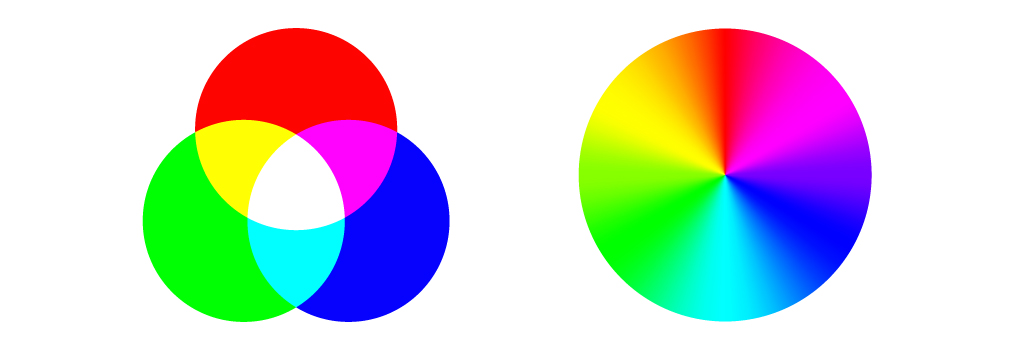
The RGB color profile consists of Red, Green, and Blue hues that combine to create extensive variations of colors that exceed the gamut of a CMYK color profile. This color mode exists exclusively in screen displays, such as in computer monitors, mobile devices, and television screens.

RGB diagram via petrroudny43. Color wheel via Yulia Glam.
Instead of utilizing ink to produce hues, the RGB profile uses additive processes to produce color by blending light. This is the exact opposite of subtractive color processes, such as mixing paints or dyes. The presence of all RGB primaries at full intensity yields white, while the absence of color produces black. The color displays on your screen result from the presence of those RGB base hues.
When attempting to print a design that is exclusively in a RGB color profile, your design will produce hues different from the screen preview. CMYK color profiles have a smaller gamut than RGB profiles, so when printing, the color present in your design will attempt to find a CMYK equivalent. These equivalents may be muddied or much less vibrant, ultimately affecting the overall tone of your design. As a rule of thumb, always set your online only designs in the RGB color profile to avoid color changes.
CMYK
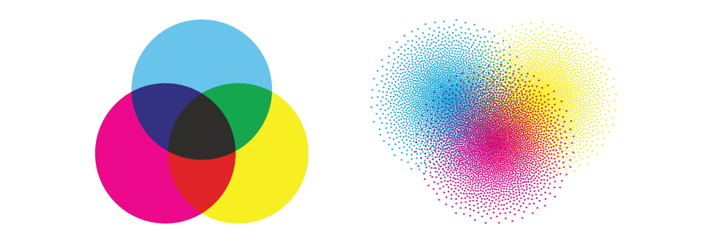
The CMYK color profile contains Cyan, Magenta, Yellow, and Key (Black) that combine to produce a range of hues. This four-color process works for any type of printer. When zoomed in on printed images you can see the four-color dots that layer to create different hues and gradations. Dots per inch result from printing and involve the CMYK color profiles. Although all printers produce prints in CMYK, the end result may vary among different styles and models of printers.

CMYK diagram via petrroudny43. CMYK dots via SkillUp.
In RGB color spaces, all primaries combine to produce white with additive color processing. CMYK modes combine with subtractive color processes, meaning all primaries mask to yield to a blackish hue. As inks and dyes are layered upon each other, they subtract from the white of the paper.
CMYK color profiles produce a smaller gamut than RGB color profiles, so only use this profile when designing for print.
Process Color
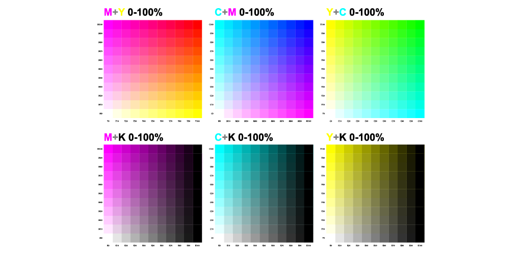
The most common method of offset printing involves process colors. These colors are produced by a combination of cyan, magenta, yellow, and key (black), or CMYK inks. Each process color is comprised of percentages of cyan, magenta, yellow, and black inks. Process colors provide a limited color range when compared to spot colors.

Image via Sailom.
Process, or four-color, printing is ideal for jobs that require multi-colored inks to produce an image or design. Each screen is printed at a different angle to produce a cohesive image.
Spot Color
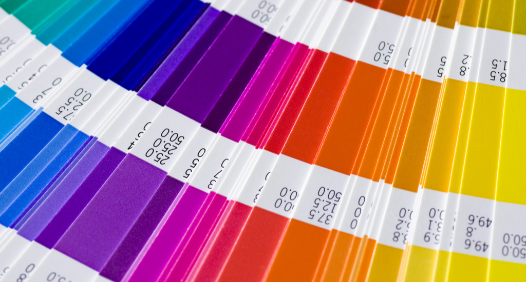
In offset printing, spot colors are produced when inks are laid down in a single run, rather than in multiple dots. Spot, or solid, colors consist of pure and mixed inks that are produced without the use of screens or multicolor dots.

Image via REDPIXEL.PI.
Spot colors are ideal when color accuracy and consistency across print jobs is crucial; company logos and color-specific brand elements that feature few colors should be reserved for spot color printing.
Finding Inspiration to Use Color in Designs
When figuring out the colors to use in your designs and other creative projects, search for inspiration all around you. Look outside and take in the natural hues, or observe established works of art across all disciplines to see colors combinations you might not have thought of originally. Step outside of your color comfort zone if you want to conjure up some truly eye-catching palettes.
Sampling colors from photographs or becoming familiar with unique color combinations from other designers is another great place to start. This helps to submerge yourself into current color or design trends, while getting accustomed to which hues translate well into your project in terms of its feeling and the overall tone. That being said, always check yourself if you’re becoming color-happy; too many colors in a design leads to a complicated mess and can obscure the overall message of the design.

Image via Chamille White.
I like to look around design websites like Dribbble and Behance to see modern color schemes and how they’re thoughtfully applied across different projects. You can also look up established color palettes from these 101 color combinations and 25 retro swatches made by yours truly.
Select the link below to download 25 free retro swatch files. Each file is available in the RGB color profile and is compatible across Adobe Illustrator, InDesign, and Photoshop. If you don’t have access to design software, you can input the six-digit hex codes shown on each color swatch image.
To download the 101 free color swatches, select this download link below. Each file within this folder is also available in the RGB color profile and is ideal for use in online or web designs.
How to Upload Free Swatch Files in Adobe Illustrator
Click the hamburger dropdown in the Swatches panel and select Open Swatch Library > Other Library and select one of the swatch files.
How to Use Your Free Swatches in Adobe Photoshop and InDesign
In the Swatches panel, select the hamburger dropdown menu and click Load Swatches and select an individual swatch file to see it pop up within the panel.
This guide is everything you need to know to get started with color picking, whether you’re choosing the colors for your logo, or selecting artwork for a room in your house. Now that you know the basics of color theory and color psychology, you’ll start to really see that color is everywhere. Stay curious about colors, because trends are always evolving and there are always new ways to play with the color wheel.
Searching for more encompassing articles to increase your color and design knowledge? Check these out:
- Everything You Need to Know About Gradients in Design
- 33 Must-Know Keyboard Shortcuts for Designers
- 5 Essential Techniques for Drawing With the Pen Tool in Illustrator
- PPI vs. DPI: Demystifying the World of Online and Print Resolution
The post Complete Guide to Color in Design: Color Meaning, Color Theory, and More appeared first on The Shutterstock Blog.
from The Shutterstock Blog https://ift.tt/2K9dPLw


Comments
Post a Comment